401k Compass > Historical Return
take control
of your 401k!
We take the guesswork out of your 401k and reduce your risk all while delivering long-term success.

historical return
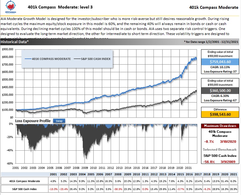
The graph below shows the performance of the 401(k) Compass’s Moderate Growth Model (blue line). The gray line is the stock market (S&P 500 cash index). As you can see the 401(k) Compass model greatly outperforms the stock market. More importantly, the risk management within 401(k) Compass greatly reduced volatility. Note the “Loss Exposure Profile” and “Maximum Drawdown”.

low exposure profile
This is a measure of volatility over time. As you can see the gray area on this graph (stock market) has deep pronounced losses. During the dot.com bust (2001- 2003) the S&P 500 was down approximately 40%. During the Mortgage Meltdown of 2008-2009, the S&P 500 lost approximately 55%. The blue shaded area on this graph displays the volatility of the 401k Compass moderate growth model. As you can see volatility is greatly reduced. This reduction in volatility is one of the main reasons for 401k Compass’s outperformance.
401k Compass is not a Registered Investment Advisor (RIA) and has no direct client accounts. Historical returns data has been compiled using price data provided by exchanges and not from actual accounts, and should be considered hypothetical. Historical returns data is generated by applying the current models to the published historical timeframes using exchange-provided price data and may differ from historical returns data published using previous versions of the models.
maximum dropdown
This describes the largest decline in value (peak to trough) over a specified time period. From January 2001 to September 2020, the stock market (S&P 500) and a maximum drawdown or loss of 55.2%. During the same time frame, the 401k Compass moderate growth model sustained a much smaller 9.7% maximum loss (red box).
See the Return and Risk Control video.
ready to take control of your 401k?
